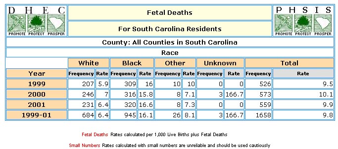
Example of a Fetal Death Table, Trendline, and Bar Chart
SCAN users should ask themselves, "What question am I trying to answer?" or "What
am I researching?" Answering these questions will help the user to determine which
variables should be selected during each step of the table creation process.
For this example, we were interested in seeing South Carolina's outcome by race
breakdown and rates for estimated pregnancy in 2001. In order to generate the above
table that answers our research interests, the following step-by-step process was
followed on the "Create a Table" page.
- STEP 1
-
Step One defines the variable whose levels will occupy the rows of the table. Users
can select year, maternal race, gestational age, weight, or region. For this example,
Year
was chosen.
- STEP 2
-
Step Two defines the variable whose levels will occupy the columns of the table.
Users can select year, maternal race, gestational age, weight, or region. For this
example, Maternal Race
was chosen.
- STEP 3
-
Step Three specifies the years of interest. If year is the chosen row or column
variable, the years you select in this step will occupy the rows or columns of your
table. If year is neither a row nor column variable in your table, all years selected
in this step will be summed together and shown in your table. For this example,
we selected a three years, 1999, 2000, 2001.
- STEP 4
-
Step Four is an optional step. In this example, we did not make any specifications
here. If we were interested in seeing this same information for a particular combination
of maternal race, gestational age, weight, or region this is the step where those
levels would be defined.
- STEP 5
-
Step Five specifies the output level for the table. Users can select counties or
DHEC regions. For our example, we selected Counties.
- STEP 6
-
Step Six defines the geographic region to tally for your table. Users can select
the entire state, a single county, or any group of counties. If trendline or bar
charts are desired, users may select up to 15 counties.
-
To select a county simply click on the chosen county in the "Region" box and then
use the down arrow button so that the selected counties move to the "Selected Region"
box, or double click on the chosen region. Multiple regions can be selected only
when region is chosen as a row or column variable. For this example, we did not
make any changes to this step; we used the default setting for All Counties in
South Carolina.
- STEP 7
-
Step Seven specifies the numeric output for the table. Users can select from frequencies
only, frequencies and rates, 3 consecutive years frequencies and rates, frequencies
and percents by column, or frequencies and percents by row. For this example,
Frequency and Rates
were selected.
- STEP 8
-
Step Eight allows the user to select the output presentation format. The user can
select any of the listed options: Table, Trendline and/or Bar Chart (Table is always
generated). Some options will not be appropriate depending on the variables that
users have selected in the previous steps. For this example Table and Bar Chart
was selected.
- SUBMIT REQUEST
-
Submit the request after completing the step-by-step process. An output table will
be promptly returned to the user based upon the specifications. Once the table is
returned, the user can view, print, or download the table. The rotate option on
the table allows the row and column variables to rotate. All specifications from
the step-by-step process are defined in the table's title and labeling. Double-check
this information to make sure you've obtained the information to answer your research
objective.
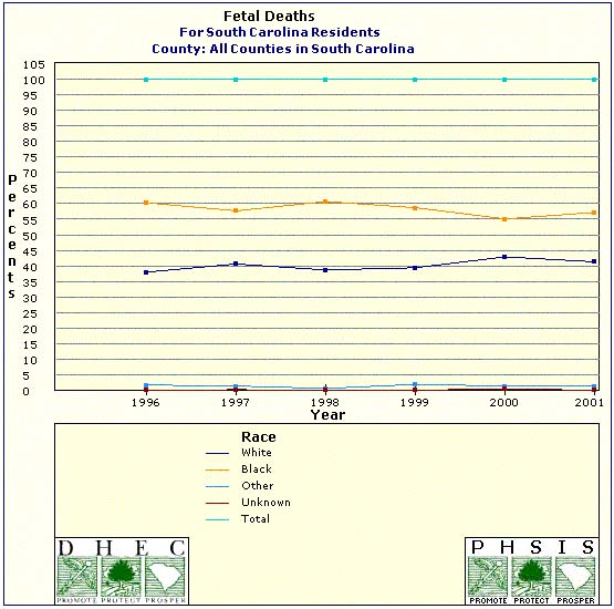
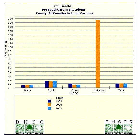
- TRENDLINE AND BAR CHART
-
In order to generate a Trendline the user must select Year as a column variable
in step 2, and must also select consecutive years in step 3. Below is an example
of trendline and bar chart. Maternal Race is still used as a row variable
but the column variable this time was Year and in step 3 we selected
six consecutive years: 1996, 1997, 1998, 1999, 2000, 2001. Frequency
by Column was chosen in step 7.
- INTERPRETATION OF DATA
-
Interpretation of the table is the user's responsibility. Thorough labels are provided
to make interpretation more intuitive. For this example, the fetal deaths for the
year 2001 were higher for blacks, and other races than for whites. The fetal death
rate for whites and others is much lower than blacks. For every 1000 black women
in South Carolina in the year 2001, 16.6 have a reportable fetal death as compared
to 6.4 for whites. The frequency of fetal death seems to be increasing for both
white and black but their rates remain relativity stable. Rates for the unknown
race group are unstable and should be used with caution.
- WHEN USING THE TABLE
-
Please reference any data extracted from the SCAN system as follows: Source: Division
of Biostatistics, PHSIS, SC DPH.
|
|