See an example of a Cancer Incidence Table, Trendline,
and Bar Chart
SCAN users should ask themselves, "What question am I trying to answer?" or "What
am I researching?" Answering these questions will help the user to determine which
variables should be selected during each step of the table creation process.
For this example, we were interested in seeing a comparison of male and female lung
cancer rates by year for the years 1996 through 2002. From the Cancer Incidence
and Mortality homepage, we selected Cancer Incidence Modules, then selected Cancer
Incidence: Full (Research) File. In order to generate the above table that answers
our research interests, the following step-by-step process was followed on the "Create
a Table" page.
- STEP 1
-
Step One defines the variable whose levels will occupy the rows of the table. Users
can select year, race, age, stage, grade, region, and primary cancer type. For this
example, Year was chosen.
- STEP 2
-
Step Two defines the variable whose levels will occupy the columns of the table.
Users can select year, race, age, stage, grade, region, and primary cancer type.
For this example, Sex was chosen.
- STEP 3
-
Step Three specifies the years of interest. If year is chosen as the row or column
variable, the years you select in this step will occupy the rows or columns of your
table. If year is neither a row nor column variable in your table, all years selected
in this step will be summed together and shown in your table. For this example,
we selected the default of all years, 1996 through 2002.
- STEP 4
-
Step Four is an optional step. In this example, since we selected Sex
in Step 2, all the categories for sex were highlighted automatically. Also, if we
were interested in seeing this same information for a particular combination of
race, age, stage, grade this is the step where those levels would be defined.
- STEP 5
-
Step Five specifies the output level for the table. Users can select zip code, county
or DHEC regions. For our example, we selected the default of Counties.
- STEP 6
-
Step Six defines the geographic region to tally for your table. Users can select
the entire state, a single county, any group of counties, or any group of DHEC regions.
If trendline or bar charts are desired, users may select up to 15 counties or regions.
To select a county simply click on the chosen county in the "Regions" box and then
use the down arrow button so that the selected counties move to the "Selected Regions"
box, or double click on the chosen region. Multiple regions can be selected by holding
down the left mouse button and scrolling over the desired regions. Multiple regions
can only be selected when region is chosen as a row or column variable. For this
example, we did not change the default of All Counties in South Carolina
.
- STEP 7
-
Step Seven the user can specify primary cancer type that is desired. These have
been further broken down into categories according to type. If the a lung and bronchus
is the cancer type wanted users can scroll down to the Respiratory System category
and simply double click on Lung and Bronchus and double click on "All
Primary Cancer Types" in the selected box, which removes the item and leaves our
selection as we have done in our example.
- STEP 8
-
Step Eight specifies the numeric output for the table. Users can select from Number
Of New Cases, Number Of New Cases And Crude Rates, Number Of New Cases And Age Adjusted
Rates: 1970 population, Number Of New Cases And Age Adjusted Rates: 2000 population,
Number Of New Cases And Percentages By Column, or Number Of New Cases And Percentages
By Row. Users also have the ability to generate 95% confidence intervals for the
rate selection that they have made. This is done by clicking on the box marked 95%
Confidence Intervals. For this example the default, Number Of New Cases And Crude
Rates was selected.
- STEP 9
-
Step Nine allows the user to select the output presentation format. The user can
select any of the listed options: Table, Trendline and/or Bar Chart (Table is always
generated). Some options will not be appropriate depending on the variables that
users have selected in the previous steps. For this example Table
was selected.
- SUBMIT REQUEST
-
Submit the request after completing the step-by-step process. An output table will
be promptly returned to the user based upon the specifications. Once the table is
returned, the user can view, print, or download the table. The rotate option on
the table allows the row and column variables to rotate. All specifications from
the step-by-step process are defined in the table's title and labeling. Double-check
this information to make sure you've obtained the information to answer your research
objective.
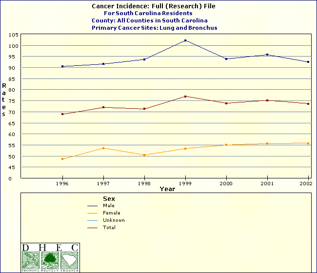
- TRENDLINE
-
In order to generate a Trendline the user must select Year
as a column variable in step 2, and must also select consecutive years in step 3.
Below is an example of trendline from the same variable selection as above, except
we chose Sex as the row variable and Year as the column
variable.
- BAR CHART
-
To create the bar chart the Table and Bar Chart was selected as the
output preference.
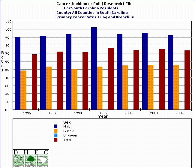
- INTERPRETATION OF DATA
-
Interpretation of the table is the user's responsibility. Thorough labels are provided
to make interpretation more intuitive. For this example, we see that females have
a lower rate of lung cancer than males. This rate difference is greatest in 1999,
males had a rate of 102.3 per 100,000 as compared to female's of 53.4 per 100,000.
- WHEN USING THE TABLE
-
Please reference any data extracted from the SCAN system as follows: Source:Division
of Biostatistics and Health GIS, PHSIS, SC DPH.
|