Example 1
Exploration of geographical distribution (DHEC Regions) and time trend of health
indicators that relate to (Very) Low Birth Weight.
Go to the table/map input page by clicking on the "Table/Map" tab.
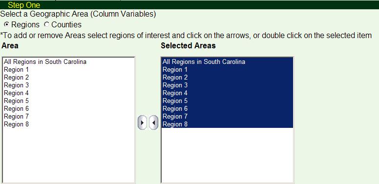
Step One:
Select DHEC Regions or counties of interest as the column variable in the output
table. Users can check "Regions" or "Counties" radio buttons to switch between the
two geographic units. In this example, statistics for all 8 regions are to be shown
thus users need to highlight all regions and the state total in the "Area"
window and click the right arrow to move them to the "Selected Areas"
window.
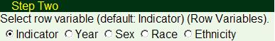
Step Two:
In this step, users can choose the row variable based on what they need in the output
table,
- Indicator: Multiple indicators can be displayed in the same output table, with each
indicator taking one row.
- Year: Statistics for multiple years (not combined) are displayed with each year
taking one row. Only one indicator can be selected.
- Sex: Statistics for "All", "Male" and "Female" are displayed in each row of the
output table. Only one indicator can be selected.
- Race: Statistics for "All", "White", "Black" and "Other" races are displayed in
each row of the output table. Only one indicator can be selected.
- Ethnicity: Statistics for "All", "Hispanic" and "Non-Hispanic" are displayed in
each row of the output table. Only one indicator can be selected.
In this example, multiple indicators are to be shown in the same output table thus
users need to select "Indicator" as the row variable, which is the default
selection for this step.
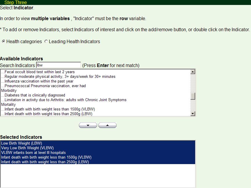
Step Three:
In this step, users can select indicator(s), of which the statistics will be shown
in the output table.
The "Health categories" (default) lists all the available indicators in this module
whereas the "Leading Health Indicators" only lists all the Healthy People 2010 objectives
included in the LHI. Users can switch between the two grouping mechanisms by clicking
on the corresponding radio buttons.
If "Indicator" is not chosen as the row variable in Step Two, only one indicator
can be selected in this step.
In this example, available indicators that related to (Very) Low Birth Weight are
to be examined. This can be done quickly with the help of the indicators search
box. Type in "lbw" in the search box and the first matched result - "Low Birth Weight
(LBW)" is highlighted in the "Available Indicators" window. Double clicking on the
indicator or clicking on the "down arrow" button below will add the indicator to
the "Selected Indicators" window. The same step can be done several times to select
other indicators related to "lbw" (Press "Enter" for the next match).
Following indicators are added with the above steps,
- Low Birth Weight (LBW)
- Very Low Birth Weight (VLBW)
- VLBW infants born at level III hospitals
- Infant death with birth weight less than 1500g (VLBW)
- Infant death with birth weight less than 2500g (LBW)
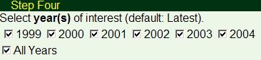
Step Four:
In this step, users can select single or multiple year(s) of data.
The "All Years" checkbox is a convenient way to check or uncheck all available years.
If "Year" is not chosen as the row variable in Step Two, the statistics for the
combined years will be shown in the output table.
Users need to select consecutive years in this step to have a trend-line in the
output page. In this example, temporal trends of the indicators selected are to
be shown for all the available years thus users can either check all the individual
years or check the "All Years" checkbox.
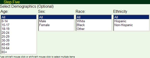
Step Five:
In this step, users can select one or a combination of demographic levels, the results
will be limited to the level(s) users selected.
Because there are only two levels for sex and ethnicity, these two are single selection
only whereas users can do multiple selections with age and race.
In this example, "All" (default) is selected for age, sex, race and ethnicity.
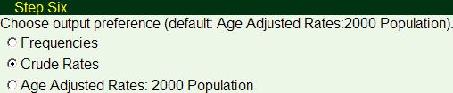
Step Six:
If users only need the actual count of the event, "Frequencies" could be selected
in this step. Doing this will disable all the options in Step Seven.
Users need to select crude rate or age-adjusted rate for more output options. As
a general guideline, for most indicators related to natality information such as
birth characteristics and mothers' health only crude rates are available. For most
mortality rates, both crude and age-adjusted rates are available. Users will be
able to learn whether an age-adjusted rate can be applied from the dynamic notes
in the output table.
In this example, trend-lines, bar charts, comparison between different regions and
comparison to the HP 2010 targets are to be shown thus users need to select one
of the rate as the output preference. Since all the selected indicators are birth
characteristics, crude rate is more appropriate. If a user selects age-adjusted
rate, the output table will show a dynamic note "CR", which means "crude rate only".
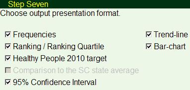
Step Seven:
This step has optional statistics outputs to provide users with more information
or help users to do comparisons, either temporal or geographic. Options in this
step not only affect the output table, trend-line and bar chart but the mapping
service as well.
- Frequencies: Provide frequencies when users select "rate" in Step Six.
- Ranking/Ranking Quartile: Ranks across all the geographic areas are calculated and
listed for the user selected areas. If DHEC regions are selected in Step One, the
results are the rank of the 8 regions. If counties are selected, the results are
ranks put into quartiles. For more information about ranking, please refer to the
definition
page.
- Healthy People 2010 target: HP 2010 target information (if available) will be added to the
output table, trend-line, bar chart, and the mapping service if checked.
- Comparison to the SC state average: Statistics that indicate how the rate for the
selected DHEC Region(s)/counties compared to the South Carolina state average, taking
the variability of the rates into account.
- 95% Confidence Interval: Calculate the 95% CI of the rate for the selected areas.
In this example, frequencies, the ranking of the selected regions compare to the
other regions, the HP 2010 target information if available, the confidence interval
for the crude rate, and trend-lines and bar charts across the year are selected.
Now it is the time to "Generate Table". If a user is more interested
in the mapping service itself, he can click "Generate Map". By doing so, there will
be no output table, trend-lines or bar charts generated but user can still get the
statistics he requested from the map page.
Output table:
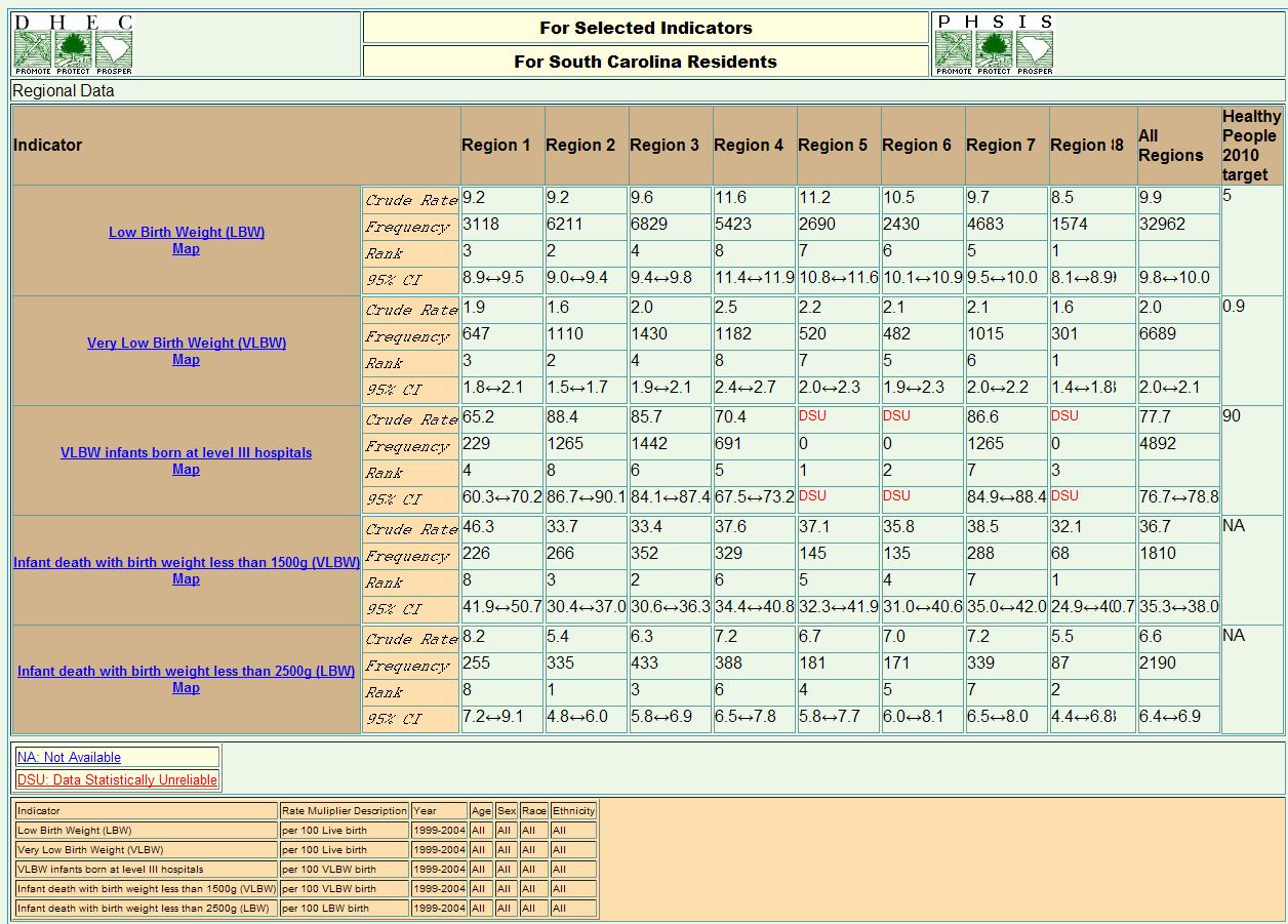
Here the output table is for all the selected regions by indicators. It shows all
the statistics requested. A few things could be noted here,
- The information for denominator and multiplier for calculating the rate is in the
dynamic footnote table. Ex. Low birth Weight (LBW) rate combining data from year
1999 to 2004 for region 1 is 9.2. From the same row in the dynamic footnote table
down below, users will understand the correct rate is 9.2 per 100 live birth. Same
goes with the HP 2010 target: HP2010 target for VLBW infants born at level III hospitals
is 90 per 100 VLBW birth.
- The footnote table also show the year, age, sex, race and ethnicity information,
which may or may not be the same as user's input page selections depending on the
data availability for certain demographic levels. Please refer to the dynamic footnote table in the definition page for details.
- Clicking on the link for the indicator name will open up a new window showing the
detail for that indicator such as HP2010 section number, data availability and source,
etc.
- Some of the dynamic notes are invoked in the output table, "NA" and "DSU" in this
case. Users can look at the descriptions of the dynamic note displayed below the
output table and click the link for more detailed information about the dynamic
notes.
- Clicking the "rotate" button will switch the regions to row and indicators to column
variables.
Trend-lines and bar-charts:
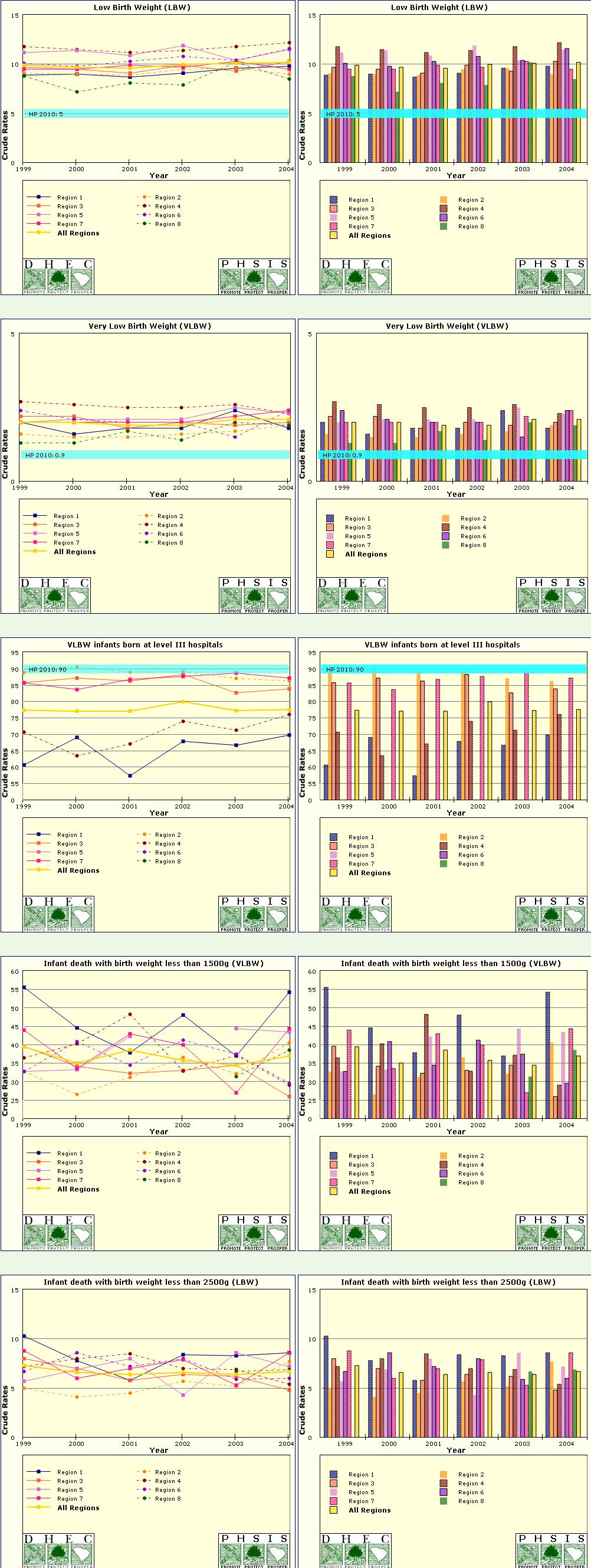
Each line/bar represents a region in the trend-line/bar chart. Different color,
shape and style help users to identify the corresponding region more easily. If
users requested and the target information exists for a particular indicator, the
HP 2010 target is shown as a horizontal bar across all the years for easy comparison.
Each trend-line and bar-chart can be saved as a picture file by right clicking on
the image and selecting "Save Picture As..."
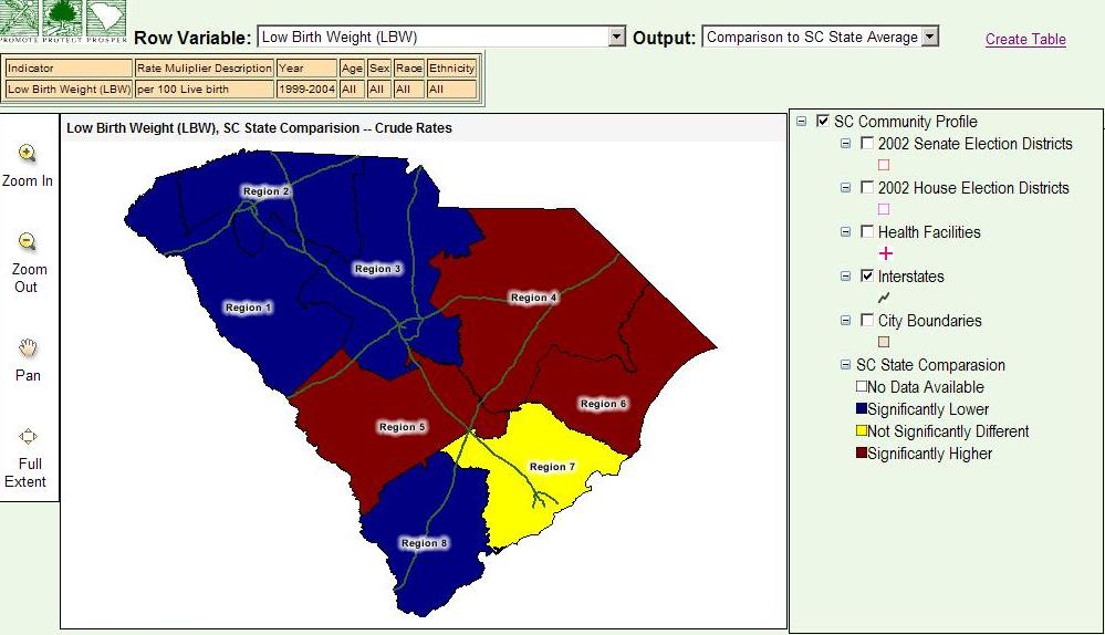
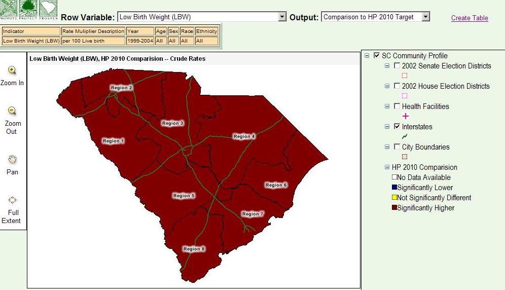
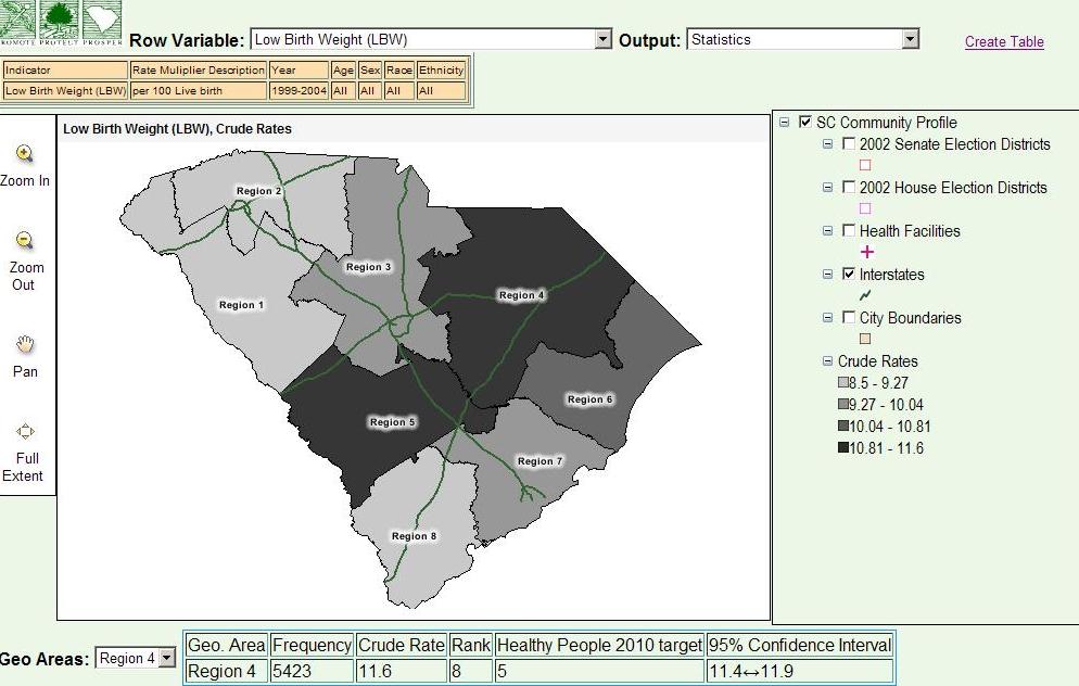
Mapping service:
A map with all the same selections from the input page can be generated from the
output table directly by clicking on the map link under the indicator name. Other
than the common mapping services such as "Zoom In", "Zoom Out", "Pan" and "Full
Extent", there are some unique features in the mapping services in the Community
Profile module.
- Users can switch between each level of the row variable and a new map will be generated.
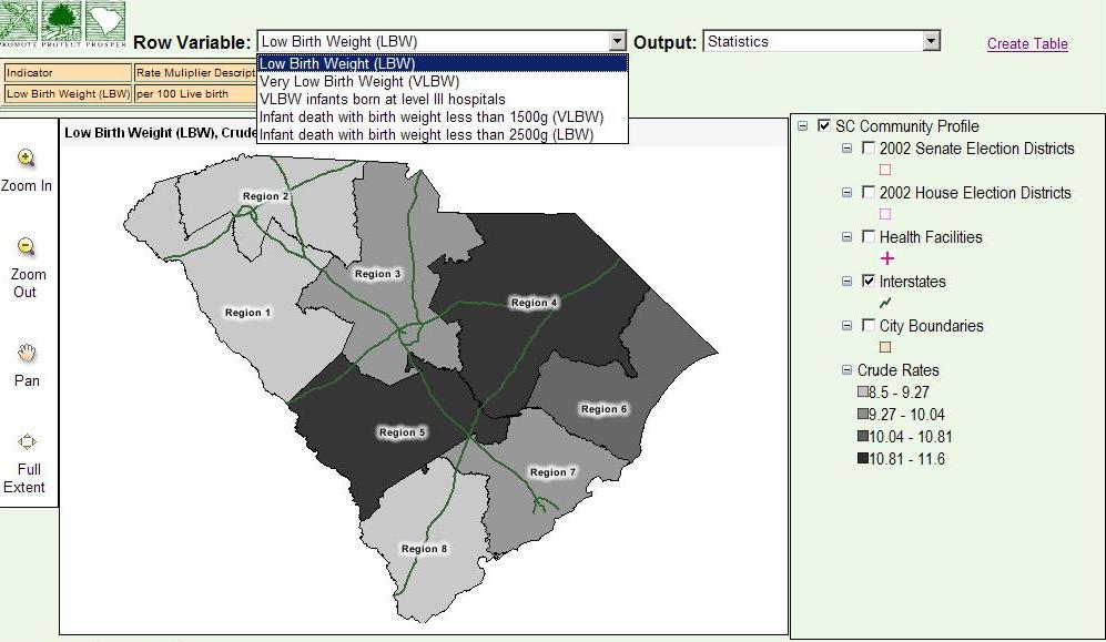
- Users can switch between three maps with different output format:
- A statistics map, which render the rate with different grey level
- Comparison to SC state average map that compares the rate for each area to that
of the state, taking the variability into account.
- Comparison to HP 2010 target map that compares the rate for each area to the HP
2010 target, taking the variability into account.
- The same dynamic footnote table as in the output table page is shown for the selected
level of the row variable
- Requested statistics can be shown for individual area by using the "Geographic Areas"
pull-down menu.
The easiest way to save the map itself would be right-clicking on the map and "Save
Picture As...". If users need all the information on the page, they could use the
Window Print Screen function and use a picture editing software for cropping or
modification.
Back to the example page